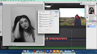
In order to make our front cover we took to photoshop to begin editing. As Evie is more experienced with photoshop she was the Cone to do the main part of the editing here. Firstly she started off by airbrushing the chosen image. I have written a step-by-step below of how she done this...
1. Change the colour mode to CMYBK and select the yellow channel, copy and past it and then invert it. Next, change the colour mode back to RGB.
2.You then copy the background layer and move it to the top of the list. To get rid of any blemishes you use the spot healing tool to conceal these - this makes the skin look clearer and more 'perfect'. Once this is done you convert all of the layers to a 'Smart Object.'
3.Next you duplicate the layer twice. On the first copy you go to fill, blur, surface blur; you need to move the scales so that you can barley make out the skin but can still make out the eyes. On the second copy you go to fill, other, highpass and move thescales so that you can make out the skin details. Once this is done you change the mode to 'Linear Light.'
4. Group all of the layers to create an airbrush folder and apply a layer mask - then use a soft paint brush to paint on the airbrush in the areas that you would like it to be applied to.
5. Merge all of the layers and use the dodge and burn tools to contour the face to make it look more defined.
Once the main airbrushing was done, Evie filled in my eyebrows and made my lips slightly brighter.
The second part to this edit was creating the actual cover itself, again I have listed a step-by-step below so you can see how we came to do this. For this part of the edit all four of us contributed to it...
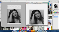
 1. First we turned the image black and white, this is because we are planning on having a colourful background therefore, we didn't want the image to clash with the colours - black and white photographs are a good way to avoid this.
 2. Next, we put the image onto a light grey background, we done this by cropping the original image into a square shape and duplicating the layer onto a new photoshop document. We chose to have a light grey background as it will make the colours that we are going to use really stand out; it is also a similar colour to the photograph then, making the cover pleasing on the eye. This is the step that we made the document the correct measurements for a CD Case.
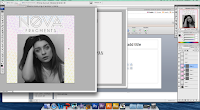
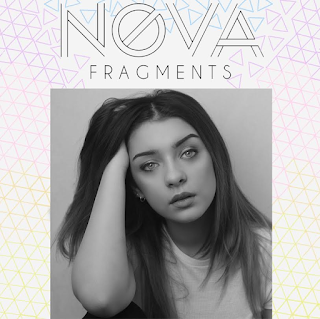
 4. This was the final stage of creating the front of our album cover, this was probably oen of the most difficult parts due to having to tesselate the shapes. We started off by copying in a basic hexagon shape from Google, we then used the gradient tool to create a smooth transition of colour throughout each individual shape. The closer we got to the titles the more we broke off the shapes, this is to make them look like fragments, just like the album title. The colours fade from blue into yellow like a sunset would, we done this so that it would show an obvious link between the album and our music video - we plan to use a large variety of sunsets throughout our video.
 This is the final outcome of the front of our album. We are extremely pleased with how it turned out as we feel that it looks professional and it also shows continuity accross the board within our project. If we were to do this again we said that we would try to use a larger amount of colours to make the cover look more vibrant.

No comments:
Post a Comment