Thursday 17 December 2015

Projection Testing


For our music video, we are wanting to do some projections, whether that be images, videos or both - for this reason, we decided to try some out before we started filming to see if we liked the overall look of them. We tried out images of sunsets, flowers and water - to create these projections we opened up the photos on photoshop and changed the brightness, then printed them on clear paper - this is so that we can use the projector without any hiccups. 
We liked the overall look of the projections however, we decided that for the image projections it would be better off if they were on a bare back, this is because the colours didn't pick up very well on a black or white t-shirt - the video projection will work with a while t-shirt as the colours are all over the place, rather than in one place. 

After this exercise, we decided that projections are defiantly something that we would like to incorporate into our video.

Digi-Pack Cover image selection

When discussing the look of our album we decided that it would be suitable to have a photoshoot so that we can get some pictures to consider for the front of the album. We have also said that the images that we do not use could be considered for other elements of our digi-pack such as the tour poster or the inserts to the album.

I was asked by my group, as I am portraying Nova,to bring a variety of outfits so that we can see what look we thought worked best for our album; we would also have a larger range of pictures to choose from. Similarly, the girls styled my hair in different ways to again, give us a large variety of pictures to choose from. We had over 100 pictures to look at therefore, we decided to cut it down to just five, the five that are placed below - the other pictures were either unsuccessful or extremely similar to the ones chosen .


Option 1


We liked this image as we felt that by having my hair up it exposed Nova a bit more, emphasising her sombre facial expression however, we felt that the position that I was sat in looks un-natural, this is something that we do not want for Nova as we want her to look comfortable with herself and her music, to show her passion.


Option 2

This is the second image that we looked into - I personally like this image as I feel that it looks like I am fairly regal however, the others in my group decided that the didn't like the angle that my head is positioned; they felt that the image wouldn't be very eye catching on the front of the album and for this sole reason, we decided to reject the image.


Option 3


This is the third option that came under the microscope. This image was under strong consideration due to us liking my shoulders being on show as well as the vacant look in my eye - I don't look over posed however, this look is a bit vague, this will stop the theme of our album being conveyed to our audience .
Option 4
This image is our least favourite out of the 5 options we have. We tried to make the image a little different by changing to a portrait frame, we liked the portrait as we feel that it brings more to the photograph however, we did not like it for this photo - it just didn't capture Nova how we wanted it to. We also didn't like it as the frame captures a large section of my body, which isn't posing, I am simply just standing there - this looks unprofessional, this is not how we want our target audience to view Nova. In addition, it takes away from Nova's face, which is one of the main elements to getting her out there and noticed in the industry.


Option 5 / Chosen Image

This is the fifth and final option for the album cover - this ended up being the image we chose. As previously mentioned, we liked how portrait frames work, and we feel that it worked well for this image. Another reason why we loved this image was due to the natural vibe it gave off, to me this photo looks effortless, this is a look that we want Nova to have - yes, I will admit, it does looked posed due to the hand position however, it isn't over-posed, this therefore, makes the image look more natural, my group members have said that I look 'subtly photogenic.'
Due to me having a relaxed stance, it enforces the idea of a chilled out state of mind, despite being through a breakup, suggesting that throughout the album Nova is collecting the fragments of her heart and placing them back together and eventually feels contempt with her life however, the vague facial expression leaves the option open for the audience to decided what the songs are about and what the overall message of the album is.

Now that we have chosen the image, we are going to start editing the album cover. 

Wednesday 16 December 2015

Photoshoot For The Album Cover

After discussing what kind of images we want to take for the album cover, we went to the studio to begin shooting.

We decided to take a range of photographs (over 250 pictures were taken) so that we would have a large variety of images to choose from, this gave use the chance to be more creative when it comes to the shoot itself. A reason for wanting a larger variety was because, even though we had a rough idea, we still weren't 100% on what we actually wanted therefore, variety was a good thing to have. We also had to consider if any of these photos were to be used on the back cover or inside of our digipack.

To begin with, Tamzin was made stylist for Nova, due to her love for makeup, hair and fashion - She decided what outfits Nova should wear in this shoot as well as how she should have her hair and makeup - she decided to go for a subtle silver smokey eye as this looks glamorous as well as natural. Tamzin also thought that straight hair is a good option for the album cover as for most of the scenes in the video I have straight hair, this will show continuity within our work.


Once in the studio, we took advantage of the studio lights implemented in the area - these lights allowed us to not only control the light source but also, make our images look a lot more professional due to the colour and brightness being top of it's game. Shooting in a studio also allowed us to have a completely white backdrop, this was very helpful as it meant that we wouldn't have a distracting background that would take away from Nova.

In conclusion, I feel that this photoshoot was very successful as we gathered a lot of potential photogrpahs, this will allow us to have a larger variety of photogrpahs to chose from to be on our front cover; if they don't make the cover, it is possible that they will be in the digipack at some point.

Thursday 26 November 2015

Album Design

When discussing potential ideas, we seemed to be set on what we wanted straight away therefore, we came up with a sketch of what we roughly wanted our overall album to look like. Below I have inserted the sketches we came up with and annotated why we have made some of the decisions we've made ....


Wednesday 25 November 2015

Album Name Ideas

Within this prezi we have discussed the names we came up with for our album and why we liked them, we also wrote about why we chose 'Fragments' to be the album name ...

Tuesday 13 October 2015

Conventions of a CD Case

To create a good Album case we need to look at the specififc conventions of each element to the case...

Front Cover
Front covers typically have the artists name clearly visable in the frame, this will make it obvious who the artist is, attracting their fans straight away; this name is normally in a unique font, making it recogniseable for the public.
The front cover also typically has the artist name in the top third of the cover to make it clear to see and physically pleasing for the buyers.
The name of the album is normally in a different font to the artist name as this will distinguise a clear difference between the two. Finally, the genre of the music is hinted by the cover art.

Back Cover
The back cover has more specific information on it such as Label's name, catalog number, barcode, website URL, social media sites, production credits and producers name. Then obviously, it has the track titles on it too - this font must link to the front cover to have a continuous look. 

Disc
The aritst name is normally on the disc as well as the album's name however, having any artwork is optional - many artists leave this blank to be 'artistic'.

Inside
The inserts in a CD case are normally thankyou's, lyrics or pictures of the artist - this needs to be consistent with the rest of the album's artwork on both front and back covers,

Spine
The spine must include the artist and album's names, along with the label's logo.


These are all basic elements of cases that we are going to think carefully about when we are designing our digi-pack.

Pitch


We decided to Pitch our idea to one of our teachers so that we could not only make it clear what our idea is exactly but, we could also get some feedback on things that he liked and get some constructive criticism on how to improve.
 
Firstly, Mr Higgins said that it is very clear that we have an understanding of how the music industry works and how artists are put together. He also said that we have successfully incorporated this knowledge into our pitch, making an impressive first impression.
Sir also said that we have lots of creative and interesting ideas and that he is excited to see how we pull it off once it's put together - he was also very impressed that we have a clear vision; he can see that we are determined to create an artistic video and portray Nova how we see her.
 
For some constructive criticism, he said that when talking about different shots and mise en scene, we should be more specific; this is to make sure that we manage to link all parts of our package together, it will also help with showing people that we are creating a brand. This also goes for locations and styling of our artist too, we need to make sure that everything links together as well as it can to show that we have created a successful brand. As a pitch is a marketing exercise, we need to really be on the ball with our ideas; we want this to feel as real as possible therefore, we highlighted that we have made some blog posts to help with this such as Location Research and The Process of Creating A Character.
 
As an end note to our meeting with Mr Higgins he said that we should be aiming to get an A therefore, we need to make sure that our editing is suitable for our song, we need to have excellent lip synching, our overall package needs to have obvious continuity and we need to make sure that we have a variety of shots.

Thursday 8 October 2015

What Is The Purpose Of Pop Videos In The Digital Age?


One of the main purposes of a music video is to promote the artist and their newest single. As we progress further into the digital age the narrative of music videos is becoming significantly more important in order to make not only your target audience want to watch the video but also audiences outside of that. Nowadays, artists are continuously trying to create attention for their music and get the public talking about it; the best way to do this is through a music video.
 
One act that I have noticed that is always trying to stand out visually is Miley Cyrus. I have found that her music videos are whacky and provocative and they always create attention within the public eye. An example of this is when she made the 'We Can't Stop' video. Within this video Miley has included things like giant dancing teddy bears, many girls 'twerking' and other aspects such as provocative body movements. She also included odd things like someone eating money and rubbing bread on their face. This is very different to most videos as it has weird written all over it; most of the video consists of things that you would not do in your every day life, which is how it creates attention. A downside to this video is that there is no real narrative. Narratives help the audience understand what the song is about as you might not really get it when you first listen to it.


In addition to this, the purpose to a music video is also to entertain the target audience. More often than not, you will watch the video multiple times, especially if the story line is interesting. The use of the target audience watching the video several times can also help with the sale of the single. Furthermore, when watching the video on YouTube, it normally gives you 'suggestion' videos down the side of the screen  - these videos being other ones that the artist has made therefore, promoting the artist and the sale of their whole album.
 
As you can tell, music videos are ridiculously important in terms of marketing and promoting an artist, especially in todays society as people are able to access media on many different platforms - this means that the target audience is becoming more interested in the visual side of music.
 
In conclusion, after writing this I have gained a better understanding for why music videos are so important in todays age.

Institutional Research

There are different record labels that are used to represent different artists. Some artists are part of an independent label whereas others are part of a major record label.
 
Majority of artists begin their career as a part of an independent label and then to go work with major labels once their fan base has grown. An example of an independent label is Domino, artists that are signed under Domino are Arctic Monkeys and Blood Orange. As an independent label you tend to have less financial backing to help their artists, meaning that the artists do not always have the same perks that larger companies would give their artists for example, due to a low budget, they wont be able to have as many music videos out, making it harder for them to become known and get in the charts however, Independent labels tend to be more willing to allow their acts to find themselves and create their own content and look, making the artist more real and raw.
 
In comparison to this, there is also Major record labels. These companies typically dominate the charts with their artists due to the financial resources they have to make sure that their acts are successful and are also able to make technical music videos. Some examples of major record labels included The Universal Music Group, Columbia Records and Warner Music Group. Some of the acts that these labels work with are Beyoncé, Sam Smith and Little Mix. As you can see, these are artists that are always in the charts, this is because of the financial backing they have to target a global audience for example, they appear on TV shows like The VMAs.
 
Four our own artist Nova, it is important that we decide what type of record label we want her to work with and how we also want our label Opal Records to be represented. As we are firm believers of staying true to yourself, we do not really want our label to appear as one of those that controls their artists and does not allow them to be themselves, for this sense an independent would be a good option also, as Nova is a new artist it would make sense for her to be under this type of label. However, as we want chart success, a major label would be good to be under as it gives her financial security under this aspect. Although, artists under an independent label can be known to have an immense amount of success, Arctic Monkeys are an excellent example of this.
 
We have decided that Opal Records will be an independent record label. This is because Nova is a new act and we want her to be able to create a fan base that love her for her not for a fake product.

Final Logos

After much consideration, we finally came to a decision on what our logos will be...
 
 
Artist Logo
 
 
We decided to have 'Arenq' as our logo for Nova, this is because of the professional look it gives off, as well as how versatile the text is. Obviously, when it comes to putting the font on our album cover we are going to play around with thickness levels to see what thickness looks the best however, for now, this is how we would like Nova to be represented. I am pleased with this decision as I think that the font is dynamic, modern and simple.
 
 
Record Label Logo


As a group we chose to have 'Sandre' as our final font for our Record label logo, however, when making this decision, we decided that it needed that something extra to make the logo look professional therefore, I came up with the solution to have a thinner, more spread our font at the bottom that says 'Records,' I think that this just gives it that extra formality, which will make us look more professional. We decided that Sandre was the best font to use as it was current as well as giving us a link to the music industry due to the lines looking like piano keys or guitar strings. We want our logo to be all black to give it that sleek look that you want in a business logo.

Creating our Logos


After researching into currently existing artists and record labels, we decided that we had enough scope to design our own. Instead of drawing some fonts out from scratch we decided to look on www.dafont.com which is a website that offers an enormous range of texts to choose from; this was we are guaranteed a professional text. Below are the texts that we have taken into consideration...

Artist Logo

The first text that we liked is called 'Kersse'. We liked this text as it has a hand drawn look to it and too me, it is rather royal looking, which will create a sense of importance for our artist. We think that this hand drawn look creates a personal feeling for our artist which will make the audience feel connected to her in some way. The only downfall to this text style is that it is quite dainty which suggests that it will not stand out on the album cover, this will not get Nova the attention she deserves and needs to make it in the industry. Similarly, due to how dainty it is, our audience might think that Nova is weak and is not cut out for the music industry, and although Nova has a sense of vulnerability about her, like every teenage girl does, this is not the impression we want her and her album to give off; for this reason, I do not think that we will use this font as our artist logo.


This text is called 'Arenq,' out of all four of these fonts this is our favourite, this is because of the lines having a geometric theme, which is something that we quite like as it makes the logo unique, like Nova. Personally, I think that this font is the most professional out of the four due to its simplicity as well as its sharp lines. A downfall to this font is that the lines are rather thin however, we can use Photoshop to make these lines thicker if need be, we can also change the colour, which shows how versatile this font it.


'Hackers' is probably the most 'out there' of the fonts as there is quite a lot going on, this is good due to it connoting a unique image for Nova, and it is extremely bold which will make it stand out however, I personally think that due to the complexity of the font it can come across as a bit tacky also, once placed on our album cover, in which we hope to have a background pattern, we fear that it will look too busy, making it unsettling for our target audience.


The last of the four texts is 'Caribbean Tool'. This is most definitely my least favourite of them al; I think that it looks too much like a font that you would see at a china tea shop or on a tattoo, which is not the look that we are going for. The only good element is that the text would appeal to extremely girly and feminine people however, Nova is an edgy character, and this font would just not fit her personality. In addition, the flowers ruin the font, if it was a plain, bold lines, we would consider this font as our final logo.
 
 
Record Label Logo

The first text we looked at is called 'Sandre' and instantly, we fell in love with it. Not only does it look extremely professional but it even has little lines that could resemble Piano keys, giving us a direct link to the music industry, which will automatically, make us have a more professional finish. The variety of bold and thin lines will appeal to most people's tastes - this element makes the text immediately recognisable, with an element of style. As previously mentioned in our Logo Research post, I think that having an all black logo is more professional, and for this reason I am not too concerned on the difficulty it will be to insert colour into our logo.
 
We chose to look at 'Dark Elf' as a logo due to the unique style of the 'O'. This personally is my least favourite due to it looking weak and too much like a video game font rather than a record label. Although it has that unique look about it, I think that it is too thin to put against any backgrounds or to use as something that is going to represent our whole brand. I think that this font looks unprofessional and if I was presented with this as a marketing logo I would be very disappointed.


'Boredom' was another favourite of mine due to the intensity of the boldness and the fact that the round parts of the letters look like Vinyl records, again, giving us a direct link to the music industry. The boldness of this text would tell people that Opal Records are best in the business and they are passionate about what they do, this is something that we want for our record label. The downfall to this logo, I think, is that it looks quite 60s/70s - this is not something that we would like out record label to represent as it could make our audience feel as if we are outdated and therefore, do not know what we are talking about.  

Logo Research

Artist Logos

We have decided to look at some of the artists we talked about when decided who's song we should do as they are female artists in the genre we are looking at therefore, they are most like our artist.


Lana Del Rey's logo is extremely simple, it is just bold block capitals. We like this logo the most as immediately upon sight, it is prominent and creates a feeling that Lana is strong headed and independent. Lana is the star and this is her new album. The bold writing shows importance and structure; it also makes it clear that she is passionate and serious about her music. The bold capital letters are something that I think my group should consider when we make our own logos.

This is Birdy's artist logo. As you can see the text is rather soft and dainty, this is appropriate for Birdy as a lot of her songs are slow, heartfelt and show a sense of vulnerability - therefore, a harsh, blond text wouldn't really be suitable to represent her as an artist. With the design you can see that a lot of thought has been put into this due to the 'B' being a lot bigger than the rest of the text, this is to tell Birdy's audience that this is her; it also connotes to the audience that Birdy is a unique talent. I personally like the thin writing however, I think if my group was to have thin writing we would maybe layer it up to give it a bolder effect. The use of unique letters if definitely something that I personally would like to consider as it can make an artist stand out against the others in the industry.


Florence and the Machine are an indie/alternative group and this is well shown within their logo, the font looks handwritten, which not only makes the logo 'alternative' but also makes it more personal to the artist. I like this logo however, to me, it does look a bit childish therefore, I don't think a handwritten logo is what we should go for.


Record Label logo

We would like to have our own record label, to help us decide what our logo will look like, we decided to look at some real life record labels to get some inspiration.
 
This is 'Q'Prime's' logo - personally, I think that the design is interesting as lime green is not really a colour that you associate with the music industry, it makes the label stand out amongst others. Another element that I like in this logo is how the circle around the 'Q' and the 'PR' looks like a vinyl record, this makes a direct link to the music industry - this is something that I would like to think about for  our logo as I feel that this makes it obvious what line of business our label is in.


Virgin Records has a distinctive logo as it is in convergence with the Virgin Television, Broadband and other aspects of Virgin as a company. The colour within the logo is a bright post box red, this captures the audiences eye however, I think that red is a colour we would like to stay away from as it can symbolise danger and death, which is something that we do not want our label to represent.
This is the Universal Music Group logo, just as Virgin, Universal is a multi media company, therefore the main part of the logo is one that is recognised across most forms of media. I like this logo as I think it is sharp and strong, in terms of advertising who the brand are. I also like the use of the colour black as I think that this looks neat and it is also bold, which will grab the attention of their customers; this is something that I would like to have within out logo. 

Saturday 3 October 2015

Naming Our Record Label


The prezi below discusses all of the names we came up with, reasoning for them and what name we decided to choose

Friday 2 October 2015

Choosing our 'Star' / Lip synching

We decided to have members of our group be in the video as we found that this will guarantee reliability - myself and Evie decided to audition for the role.

For the audition we wanted to see the lip syncing skills as this will help us see who will look more professional...

Evie

Evie's lip syncing was extremely good as you could clearly see what she was singing and she did not get a single word wrong however, we felt that it looks as if she over sang some of the words, this can sometimes come across as fake or unrealistic therefore, it is a downfall to her audition. 
Evie has a strong indie/alternative look - this fits with our genre very well, this then makes her a possible winner for the part.

Me


In my audition we decided that I was good at lip syncing, you can see what I'm signing and it looks fairly believable, the only downside is that my eyes do not really look like they are enjoying it - this is definitely something I will work on if I am to get the part.
Just like Evie, I have an indie/alternative look although, I can also look quite bohemian, which makes me a strong possibility to win the part. 


Final Desicion


As a group we decided to have me as the girl in the video, this is because of my versatile look and strong lip syncing skills. I also have a background of acting and dancing therefore I am more likely to do a better job on this type of project as I have good acting skills and I am not afraid to do some more embarrassing things to get a good shot. As an improvement for me I am going to work on making my eyes look more alive and my facial expressions to be more excitable or sad, this is so that I will be able to convey a variety of emotions in our video just by using my face.

Thursday 1 October 2015

Digi-Pack Research (Album Covers)

We have decided to start looking into other artist's album covers to get some inspiration for our one. We have looked at Lana Del Rey, as she is our overal inspiration, Kate Nash, as she was a contender for our chosen artist, as well as Eliza Doolittle for the same reason.


Lana Del Rey - Born To Die


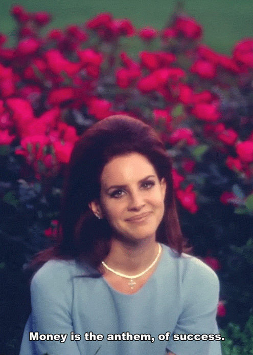
This is the 'Born To Die' front cover. To me, this is a fairly simple album cover as it consist of a simple low angle shot of the artist, the artist and the album's names and then a scenic background; I like this as there is nothing too flashy about it, yet it tells the audience that she is a serious singer and that the album could be slightly depressive, you can tell this due to the stern look on her face. 
The colour scheme of blue, white and red go well with the theme of America; Lana is from New York therefore, she is a very American girl, this theme is also shown in the songs on the album such as 'National Anthem,' and 'American.'
I like that Lana is in the centre of the cover as it draws all attention onto her to show that this is her album, she made it, she wrote the songs, it's her hard work. Her clothes suggest innocence due to the colour of the shirt however, the red bra and red lipstick suggests that Lana has a more devious side to her, which will intregue any listeners to buy her album. The colour red could also hint what the album's theme is due to red meaning both  love and danger.
The font works well as it is nice and simple yet it is bold, this is effective as it makes sure that people know what the album's called and who it's by.
I personally, really like everything about this album, I think the background image is nice and summery, the image of her is stunning and and the colour scheme works perfectly. The only thing I think is a bit of a downfall is that you can't really see her eyes properly, this is something I would like to see as she has lovely eyes.


The back of the 'Born To Die' album is also quite nice as the colour scheme has mostly run through, apart from the red; the font is also the same. I like that the tracks are the main focus of the back and all of the legal information is written in small font right  at the bottom, this is good as it puts all the attention on the most important part of the back cover. 
I don't particularly like how the tracks aren't in a particular structure therefore, this is something I would like to avoid when I make my own digi pack. A final thing I don't like about this part of the album is the fact that there is no red on it - I feel like as red was on the front cover that it should be on the back cover as well.


Kate Nash - Made Of Bricks


The 'Made Of Bricks' album is quite creative as the image on the cover is made completely of leggo, this is effective as it fits in with the title of the album due to the refernce to 'bricks.' I like this album cover as it is fairly childish and I feel that it conveys Kate's personality.
The colour scheme of blue and white is effective as it is clean and you can read the font clearly due to the contrast in colour. I think that the font ties in well with the childish aspect of the album due to it being like a young child's handwriting.
The image is nice as it sets the scene of a nice home, this can hint that the album could be about everyday life or families as these are the things you assosiate a home with.
Overall, I think that this is a well put together album cover and everything links well however, I don't particularly like the idea of having toys on my front cover so it is a concept I would like to
stay away from.


The back cover relates to the front cover due to the colour scheme and font; as these aspects have been carried over, it ties it all together, making it aesthetically pleasing for the audience. 
I personally think that the back cover is quite boring as the colours are dull and there isn't a lot going on however, the simplicity could please some as they can clearly see what each track is called; these elements are something I think my group should think about when it comes to creating our digi-pack.


Eliza - In Your Hands

This is Eliza's 'In Your Hands' album. To me, this is a simple cover as there is only one image and basic font on it, simple album covers tend to be the in thing currently, therefore, we need to decide whether we want to stick to this or if we want to break the  mould and go for something a bit different. The image is in black and white, this is to make the bright pink font stand out; Eliza has chosen to have two different fonts on her album, one being her logo and the other being a handwriting font, making the album more personal to her - this is creative as it creates a connection between her and her fans. I really like the way that she has chosen to have her body both under and over the fonts, this makes the album name stand out as well as the artists face; as Eliza is a beautiful girl, wearing a low cut top, by having her face fully visible it creates an element of sex appeal, this is to draw in male buyers, as the well known saying says, 'Sex Sells.' I like that she is placed in the centre of the frame as it makes it more symmetrical, which will please her audience, I also think that the black and white image is effective for the reasons previously mentioned. I think that this is a beautiful cover, that I would deeply consider taking inspiration from, the only think I would change is the album title font as it is kind of hard to read.


The back cover is well thought through due to the colour scheme, font and image being the same or fairly similar to the back and sides. Eliza has chosen to have her track names to the left hand side, this allows easy reading as well as sufficient room for a second image of her to be placed in the frame. As a change, the font on the back is white instead of pink, this is so that the black and white theme is reciprocated; the white also makes the text a bit easier to read. All legal information is below the track names, this is a good idea as the audiences eye's will automatically look down that direction so they will read the text. Again, sex appeal is introduced by the image of Eliza being a bit more revealing, the strap on her top has been placed down and you can see the outline of her knickers - this suggests that the album is more grown up than her previous albums where she is known as 'Eliza Doolittle.' I like this back cover as the colours link to the front and you can see that she is more grown up then she used to be - I would like to consider having an image of our chosen artist on the back as I think it makes the album more personal for our artist and will create a deeper connection with the audience. 


Lip Syncing Research


We wanted to gain some further knowledge on how to create successful lip syncing therefore, we took to the well known video sharing platform that is 'YouTube' to do some research. The Tonight Show With Jimmy Fallon is a successful late night talk show, presented by Jimmy Fallon. Within his show he has a segment called 'Lip Sync Battle' in which celebrities choose two songs each to lip sync too and they 'battle' against each other and Jimmy himself - above is an example of Anne Hathaway's version of 'Wrecking Ball.' By watching a numerous amount of these videos we discovered how to create successful lip syncing when focusing on a few minor elements. We were able to analyse the key characteristics in a lot of detail whilst the contestants were performing which then helps us progress our version.
I found that the main element to a successful lip sync is the timing; even is you are a millisecond out of time, the whole thing can look awful and unrealistic. In the example you can see that Hathaway is fairly in time, showing that practise and knowledge of the song is key.
Facial expressions are also important when it comes to lip syncing - if you're 'singing' a sad song yet your face looks happy, it will look quite obvious that you're lip syncing. In the parts where the song sounds more powerful, the artist must look as if they are exaggerating their mouth movement to match with the song. Overall, if your facial expressions do not match the song, it will make your video look unprofessional.

These are all points that we need to take into consideration when lip syncing in our video as we want our project to look as professional as possible. As a group, we will be holding lip syncing auditions to decide who is the best candidate for our video.

Friday 11 September 2015

Production Schedule

Filming

 
1. 1st September 2015 - Rochester 

On this day we are planning to film the 'break up' scenes. We chose this location as it has an old feel to it, making it perfect for remembering the past, just as you would when you break up with someone. The whether forecast for this day is also supposed to be rather glum therefore, this will create a sense of pathetic fallacy within our video.
We are hoping to film some long shots, tracking shots, close ups and mid shots - we wanted to start with a variety of different shots so we are able to test out which ones work and which ones don't.
The outfit we are wanting Nova to wear is something slouchy and comfortable yet stylish as well - we suggest some mom jeans, an oversized hoodie and a crop top to place underneath.

2. 7th September 2015 - Whitstable

This filming day we are wanting to start filming the lip synching parts of the video. We chose this location due to the beach setting and summery feel that it has to it - this will make our video look more seasonal as well as the water being a calming element. The whether forecast is supposed to be rather bright, perfect for a beach location.
We are hoping to film close ups and tracking shots on this filming day - close ups being for the lip synching, this pulls all focus to the lyrics, the tracking shots will be used to create the point of view of the boy.
The outfit we want Nova to wear is black dungarees, a white off the shoulder top and black converse, this is a cute everyday outfit but also brings a bohemian feel to the video.

3. 15th September 2015 - Faversham

Faversham is the location we are filming the bonfire scene in as well as lip synching -  we chose this location as it was a more natural one as well as having more opportunity for beautiful sunsets due to the farm land around it. Evie's grandparents also live there so we had a location that we were able to set up our equipment.
We are hoping to film some lens flares as well as some establishing shots, this will help us achieve a more artistic look to our video.
Nova will be wearing two outfits on this day - one outfit consisting of a grey jumper and jeans and the other being a black crop top with jeans - this is to give a casual look as well as a more stylish one.
 
4. 7th October 2015 - School
 
On this day we are hoping to do two filming sessions- one being in the photography dark room so that we can do some tests for the projection and one being by the red ivy tree that our school has, this is so that we can have some autumnal scenes in our video to show that the relationship progresses over the course of the seasons.
We are hoping to film tracking shots and close ups - this is to stick with the continuity of the rest of the video as well as showcasing the locations that we are in.
the outfits I will be wearing are just simple black and white tops with beige or black skirts - this is to show a more simple side to Nova.
 
5. 8th October 2015 - Dark Room
 
This is the day that we are going to do the official projection filming days - we are going to try to do some shots with Nova not wearing a top as well as ones of her wearing a top, this is to show vulnerability within our artist.
Our main focus for this filming day is to film some pans to show the image that we are projecting on Nova's body- this is to make our video more artistic.
 
6. 14th October 2015 - Margate
 
This is our final filming day, we decided to go to Margate as it is a seaside town with a few art exhibitions that we feel would be appropriate for our video. The only negative about this filming day is that the weather forecast doesn't look appealing however, this is something we could use for pathetic fallacy so it isn't all bad.
Nova will have three outfits on this day. one being a ripped white thsirt with black jeans, another being a grey jumper with black jeans and the other being a long black coat with jeans - this is to show different personalities of Nova.

Thursday 10 September 2015

Storyboards

In preperation for the filming of our music video, we created a story board. This is so that we can create a plan of how we want the video to look and the different shots that we are planning on usuing; Story boards also help up figure our the scenes in corrilation to the lyrics. This story board gives us a basis to work from and will help us develop our idea; it is just a guidline for us, so some things may chnage when it comes to the final product. Below are some images of our story board...


As you can see we are planning to use a variety of shots, this is to make the video more interesting and to make sure that our audience continues watching. We don't want our video to be broing or 'samey samey' so we decided that by having a large variety of shots/scenes in our video we will hopefully stay away from this. From these images you can also see that we are experimenting with different ideas such as hologrpahic lighting and tracking shots, these are ideas that we hope to at least be able to try out as they are fairly inventive and we feel they can make for a great video.


You can also see that we have written the lyrics we would like to lip synch next to the frame that we want to lip synch these in, this is so that when we come to editing our video, we know roughly what we want to aim for; it also helps in terms of filming so that we can set up approriate locations to be as our background.


As I have previously mentoined, this story board is just a guildline for us to follow when we go to film, we may change some shots or camera angles as when we go to put these frames into practice, they might not work as well as we hoped.


Location Research


For our video we are wanting many 'outdoor' locations to create a theme of nature within the video; we also want Nova to come across as a down to Earth woman that appreciates the beauty in nature therefore, locations that are outside will help us achieve this.

Since Lana Del Rey is our inspiration for our artist and overall look of the video we decided to research into some of her videos to see what kind of locations she had chosen to use...

In the music video for 'Ride,' Lana uses a lot of different locations to create a dynamic video.
One main location she used is a 'desert,' this is to create a sense of confusion as she is shot swinging on a tyre swing, something that you do not typically find in a desert, this is an effective location to use as it gets the audience talking about how strange it is, this not only gives the video publicity but it also makes the viewer want to continue watching to see what else Lana has up her sleeves. However, you can say that a desert is not the best location to use since it doesn't really have anything to do with the lyrics, this breaks Goodwin's theory of the visuals and the song matching; this may confuse the audience in a negative way.

In the music video for 'Blue Jeans', one of the main locations used is a swimming pool. This creates a sense of missing luxury as the song is about her partner leaving her therefore, she is missing a part of her 'paradise.' I think that this location makes for an effective video as it leaves room for interesting shots both in and out of the water however, you can say that this location doesn't have anything to do with the lyrics so it isn't really there to satisfy the audience in the sense that the song and the visuals connect. Overall, I feel that this is a successful location due to the variety of shots you can get and because it shows how something so simple as a swimming pool can create a depressing effect.


Lana Del Rey's 'National Anthem,'  uses multiple locations however the one that caught my eye the most was the flower field - this is because of the vibrant red colour of the flowers. In terms of this video the colour represents love, Lana's undying love for her partner in the video. This location works well due to the simplicity of it, there really isn't anything special in a regular field of flowers however, in this video, it captures the romance in the video and shows us the connection between the couple. A downfall to this location is that there isn't much character or a wow factor to it therefore, it might not attract as many people as Lana is hoping too. Overall, this is a successful location for me personally due to the simplicity but, as a general observation this may not be the best location Lana has ever used; I think this type of location is something my group need to discuss in a very critical way to make the right decision for our video.

In 'Video Games' one location used was just a corner of a room, with a plain white-blue wall. This to me, is a boring location due to there literally being nothing to it; it's too simple. A positive to this location is that it puts all focus on Lana herself, making her the centre of attention - I think this is effective as it can boosts sales from the mega fans that adore Lana. As a whole, this is not a location that I would put in my video as it is too simple with nothing to it.


In 'Summertime Sadness' one location used is the edge of a cliff looking over the skyline of the city she is in. I think that this is extremely effective due to how you can focus on Lana herself yet you can also focus on what is around her, this location creates drama and a breath-taking sensation due to the limited light and the open space. Personally, I cannot find a bad point about this location therefore, it is something that I would definitely pitch to my group.


In the 'Born To Die' video there is an indoor location, it looks like the inside of a castle/ the throne room. I like this location as it shows power and importance as well as showing class and grace, these are qualities that we would like for 'Nova' to have. A negative about this location is that it doesn't give us much room to be creative due to restrictive furniture whereas, with an outdoors location, we could use the nature around us to create some interesting shots. Overall, I feel that this is the worst of the locations due to it being rather restrictive in terms of filming however, as a place to convey our artists personality and essence, this is a very good location.


As a whole, we have decided to have a mixture of indoor and outdoor locations however, we would like more outdoor locations as we feel that the nature invovled will give our video character as well allowing a breathtaking feeling overwhelm our target audience of 16-22 year olds. 
From the prezi above, you can see what locations we are hoping to use and reasons why - when it comes to the filming days I will go into more detail as to why we liked the location we had used.


Sunday 6 September 2015

Andrew Goodwin's Theory

In a previous blog post called 'Student Video Analysis'  I analysed videos based upon the theory of Andrew Goodwin however, I did not really go into detail upon what his theory actually was; therefore, this post will discuss his theory for a better understanding upon it.


Overall, Goodwin implies that music videos have a set structure that ALL artists follow.

1. Music videos normally show stereotypes of the particular genre, for example, a girl band would feature outfits to match each girls 'personality' and dance routines whereas, a rap video would be based around the main artist (typically one of high wealth and status), surrounded by women in revealing clothes. Our song, 'Without You' by Lana Del Rey is in the Alternative genre; so far out planning is rather stereotypical as we want to have a 'Vintage/Retro' vibe and look to our video and our artist - this fits in with Goodwin's Theory


2. Voyeurism - This is the act of looking, especially secretively, at a male or female that is being portrayed in a seductive manor for their own pleasure. Andrew Goodwin says that the act of Voyeurism is mainly used to sell the artist's music or gain popularity through sex appeal - 'Sex Sells'. This can be also shown through props; a good example of this is Miley Cyrus' 'Wrecking Ball' - her actions with the sledge hammer automatically make the video more sexual as it implies that Miley wants to indulge in sexual activities.
When it comes to our music video we have decided to try and keep Voyeurism to a minimum as we would like to break some typical conventions of the music industry so that our video stands out against all other videos; also, as our artist is a female we would like to try and stay away from voyeurism as it is fairly biased - it tends to objectify women, as our artist is fairly young we want to make her a good role model for any younger fans, and this is not the best way of doing this. 7
An aspect of Voyeurism that we would like to use is direct eye contact with the audience as it creates a bond between the artist an the audience; we would also like to have the video in the point of view od the 'boyfriend' therefore, any eye contact with the camera will show a form of connection within this 'relationship' - this then breaks the '4th Wall' as it gets rid of the divide between the audience and the artist. We may use some form of sexual elements just to make our artist sell however, this is yet to be discussed.


3. A relationship between the music and the visuals is something that Goodwin has mentioned in his theory; meaning that the lyrics match what's going on in the shot. We would like our music video to have this convention as we agree that the lyrics and the visuals should be matched in some way - this will make the video more successful as people can relate to it more however we do not want to have this take over our video as it gives us room to experiment with different ideas and themes. We understand that by not having the lyrics and the videos match, you can create an extremely successful video as a huge contrast is made, which will make the video successful due to people talking about the contrast.

4. The demands of the record label - most record labels have certain demands that their artist should be represented as. For example, female artists are made to be 'sexy' in order to draw in a male audience. We would like to keep the sexual elements in our video to a minimum - our inspiration is Lana Del Rey and her videos aren't mainly focused on sex but the quality of her videos; if we focus on this too it will make the quality of our video a lot better as well as make our artist appear to be focused on her work more than her sex appeal.


5.Intertextual References - These are references to existing forms of media such as television or books. Generally, the audience like being 'in' on the reference, this will make the video more likeable due to the audience feeling like they're part of the 'joke'. We have decided not to use intertextual references in our video as we do not feel that it is necessary for out song - the lyrics make no reference to any other media texts.


Lana Del Rey uses intertextual references in 'National Anthem' due to her referencing JFK and Marylin Monroe.


6. Performance Based, Narrative based or concept based? - A narrative based video is about telling a story, There is also a fragmented narrative, which is when the story has not got a set order, showing flash backs and flash forwards - the audience would have to piece the story together themselves; we decided to go for a linear narrative as we plan to tell our story in some form of an order however, as we want to incorporate a break up into the video, we may have to change this to a fragmented narrative, this is something we will discuss in the editing process.
A concept based video puts forward a specific theme or idea, we are planning for our video to be similar to this but due to the storyline being so obvious, we do not really class our  video as a concept based one.
Finally, performance based videos show the artist in action - there is a lot less camera work as the focus is that someone is performing so the video tends to be fairly simple; mainly close ups and wide shots are used to showcase the artist/band. Personally, I think that these types of videos are good to show people what it would be like to see the act in concert however, I think that to draw the audience in, you need to have a story line involved. Circa Waves' 'So Long' music video shows the band in action in different locations, making it feel more like a music video then a soul performance.


Overall, I would say that my group is influenced by Andrew Goodwin's theory and we aim to stick to most of his findings however, we do like to be unique and break the status quo so it is inevitable that we are going to break some of the rules to make our video more personal.