In reflection, I personally feel that the combination of our main product and ancillary texts are very fluent and successful. Whilst creating both the video and our digi-pak we had a clear vision of what we wanted them to look like and what techniques we wanted to use to represent Nova's image. As stated earlier on in the project, Nova is an indie/alternative artist and this is something we focused heavily on and worked around whilst creating our project.
Within our video we focused on a few things in particular to help represent Nova's alternative style and artistic eye. The first thing we took into consideration when creating our video was the mise en scene. Below I have listed 4 main key features of mise en scene and the ways in which I feel we have shown them and applied them to the style that we were going for...

Our settings are something that as a group we are very pleased with and something I feel made a big impact on the overall feel of the video. We feel that our locations are an element of our video that is really successful and help our video to stand out amongst other music videos. As you will be able to see from my 'Filming Day' blogs, we ventured to a mass variety of interesting, scenic settings that we felt were intriguing and that would highlight the alternative theme we were going for. One of my favourite locations that I feel really represents the alternative scene is the Turner Contemporary Art Gallery in Margate. I feel that this location was particularly effective, the range of contemporary art available to us enabled us to gather some creative, original footage that stood out amongst the rest of the more natural footage we got from locations like Whitstable. In reflection, I feel our variety of different locations not only helped to create an intriguing video that expressed Nova as an indie/alternative artist but also expressed our determination towards our work - we really wanted to push the boat out for our video and were willing to go out of our way to different locations to show this.
 In addition to our range of settings, we also thought very carefully about how we wanted to present Nova and her alternative image through the use of costume, hair and make-up. Although we wanted Nova to look edgy, we also wanted her to have a sense of innocence and femininity - she is only a new, upcoming artist and even though her music is primarily alternative/indie, we felt that by having a diverse range of outfits, she will be able attract a mass audience who may not necessarily be fans of her type of music. It was crucial that we promoted her effectively. We often kept Nova's hair and make-up simple and effortless, for we felt that her voice should attract enough attention on its own, there was no need to have bold, over the top looks. We took a lot of inspiration from Lana Del Rey as she is often featured looking fairly simplistic yet always manages to make an impression on her audience.
The lighting and colour of our video is an element of it that we focused very heavily on. It was very important to us that a sense of continuity was apparent throughout our video and so had a set colour scheme of pink and blues. A large majority of the time, these colours could be found in real life settings, for example the blue undertones available to us at the beach from the natural lighting and the pink undertones available to us from the lighting available to us at the art gallery. When these colours were not available in real life, we either digitally imposed or enhanced them during the editing process. We feel having a colour scheme of pink and blue helped to represent our genre as blue holds connotations of sadness whereas pink holds connotations of love and deep emotion - all feelings that are apparent within the alternative/indie genre.

Lastly, we thought very carefully about the positioning of our artist within the frame. Although this element of mine en scene does not directly link with our genre, we felt that it was very effective as it is something different. The audience usually expects to see the artist straight in the middle of the screen, so by having Nova ever so slightly off centre in the majority of our clips, we felt we were mixing our video up a bit again, allowing for it stand out amongst already existing music videos.
To ensure we linked our video and ancillary products successfully we carried through a large portion of the mise en scene elements from our video over to our digi - pak. For example, on our album cover we ensured our two main colours of the colour scheme were evident...
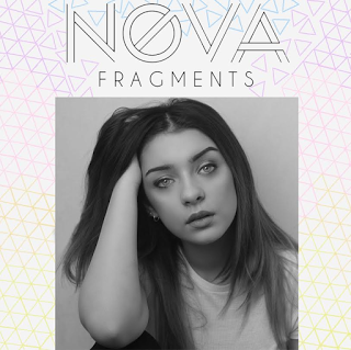
As you can see, pink and blue are both present however, for our digipak we decided that we wanted to incorporate some more colours as well as give the audience a little bit of variety. Despite the use of other colours in amongst our primary colour scheme, we felt the repeated use of pinks and blues would be effective as our target audience would be familiar with them and would be able to quickly associate them with Nova. In addition to the repeated use of the colours, we continued with Nova's simplistic make up and costume. Again, enforcing the idea that Nova's talent is more important than her looks. In addition to the mise en features, we included geometric shapes as a way of subliminally connoting that Nova's music is of the alternative/Indie theme. These types of shaped are often associated with people who have an indie style and so by putting them on our album cover, we are making Nova relatable to them.
As a way of linking our album cover and tour poster together, we also included the geometric shapes ever so subtly on the poster with the Geometric shaped evident on my dress. Similarly, we linked the black and white image on the album with the grey background apparent on the poster - both of these may not strike the audience initially but, will allow them to link the two together subconsciously.

As well as using the visuals as a strong link, we also guaranteed continuity by our use of the exact same text throughout our dig-pak. Not only did we want to use the same text to solidify that strong link, we just thought it looked professional - if we continued to change the text we used throughout the project our audience may get confused and assume the two pieces of work are not linked together.
In conclusion, I feel that we managed to link our ancillary products and the video very effectively, whilst also being able to link them both to our genre and the type of image we were going for with Nova. I am pleased with the work we have produced.
No comments:
Post a Comment