Since AS Level I feel that I have improved a vast amount in my research and planning; my A2 research and planning, I feel, is a lot more detailed - this shows improvement as last year, although I had a lot of research and planning, it wasn't really detailed enough whereas this year, I made sure to evaluate in my posts and use technical terms.
My editing skills have also improved as I have learnt how to do things such as colur correction and cropping a clip so that the framing is smaller, this makes my work look more refined and professional.
This year a lot more effort has been put into my work, I made sure that we had a plan of exactly what we wanted to do whereas last year, we just had a rough idea.
I have also improved the equipment I used this year. In AS we used a smaller camera that was low quality however this year we used a much larger one that had a higher HD - this allows out work to look more refined, especially in comparison to last year.
We used better technology as a whole for example, studio lights and projectors to make our work brighter and more artistic.
This unit was fairly different to last year as it allowed us to have more scope to be create, we had less limits whereas last year, we had a restraint on what outfits we could wear and what music we could use as we were told what genre our film opening had to be. I feel that this unit has allowed my confidence grow in the creative side of the project, which is helpful as our music video was fairly artistic. I preferred the music video as it was a lot more fun to make as a whole, we went to lots of different places this year in comparison to last year when we only had two locations and one of them was school.
My knowledge on technology and media has a whole has dramatically improved since AS - I am really happy with our end product, I like it a lot better than our film opening last year, I feel that this was because there was more to do therefore, I got more emotionally invested in the project.
Prior to finishing our video, we posted a rough cut of it on the social media sit, 'Facebook,' this enabled us to get some feedback and make improvements for our final version. By posting this version on a social media site it allowed it to get some exposure to a wider audience, some of which are outside our target audience (16-23). Sharing the video and receiving feedback allowed for us to see what our audience didn't like about the video therefore, giving us some improvements to work on, equally showing that we value our viewer's opinions, even those who aren't in our target audience - I found it interesting to see whether these viewers had a similar taste to our target audience, which we soon found to be true.
Our target audience also includes males as well as females, this is because we felt that our chosen artist's music (Lana Del Rey) appeals to both men and women. We asked around some male friends and our findings were that most of them liked Lana's music, in addition, Lana is an attractive woman and has a large sex appeal to her male audience. Although both sexes can relate to heartbreak we feel that women will relate to Lana's music as she sings a lot about heartbreak and her emotions, this is something that stereotypically, women tend to be affected more by these topics which is therefore a reason why females are also our target audience.
Members of the public older than 23 liked and commented on our video saying that they found our project 'Highly enjoyable', this is also evident through our target audience. As mentioned in a previous blogpost, our viewers didn't enjoy our original ending, or the alternative ending we showed them - they felt that we needed something else as it wasn't the same standard as the opening of the video; we all agreed on this, it confirmed some of the doubts we were already having. As a result of this we decided we had another filming day in the studio and created a whole new ending. The images below show that we took the criticism on board.
Before audience feedback
After audience feedback
We felt that these changes were necessary to keep our audience happy and make our video the best it can be. The changes were successful as the indoor location added a new flare to the overall look of the video, this was because none of our locations were in a studio, they were all out on location, so by having something different thrown in the mix, it implements a whole new dynamic. By having a studio location it sticks to typical conventions of music videos, a large majority of current music videos have a mix between studio locations and outdoor locations - I feel that it is helpful to adhere to typical conventions as it shows some tradition in our video and is more familiar to an audience however, having a mix of locations can also be seen as unconventional so there is that to think about.
Another comment that the audience made was how they didn't like one of the red ivy shots as they felt that when Nova's hair covers her face you cannot see what she is singing, although they liked the concept of the shot. To overcome this issue we deleted the clip and replaced it with one of Nova singing on her bed - this fits well as there are more scenes in the same location, therefore some continuity was shown.
After making the improvements mentioned above, we decided as a group that we were happy with the final outcome and that we should put it on YouTube. It was important to us that the video was uploaded to Youtube as it is the biggest video sharing site on the internet that absolutely everyone can have access to, we want our video to be seen by as many people as possible as we value everybody's opinion regardless if they are in our target audience of 16-23 or not. This upload is also important as it will allow us to get some male opinions as everybody in our media class is female therefore, we needed some opinions from boys as they are also in our target audience.
Within the first day of the video being uploaded we received 21 views an 4 thumbs up, we did not receive and dislikes, this told us that so far the video has been successful. This was a great start for us.
The next thing we done was create a survey on Surveymonkey to get some more specific results, this allowed us to see the exact things that our audience liked or disliked. We wrote the survey for our target audience however, it was open to everyone as we want as much feedback as possible.
This is our survey
We were fairly specific with our questions as we wanted straight forward answers. We created a mixture of both open and closed questions to give ourselves detailed statistics, the questions are below...
The questionnaire received a handful of responses. The graph to the left shows that 20% of responses were male and the other 80% were female. Even though this is a large difference, it was still important to us that at least one male could answer the questionnaire so that we have feedback from both sexes. Also, Survey Monkey allows us to see each respondents specific answers therefore, we can see exactly what the male has said, giving us more detailed statistics, this
also allows us to compare the answers to the female respondents.
One of the most significant questions that we have asked is , "What is your age?" This was so important as tells us whether respondents were in our target audience bracket or outside the bracket. The results tell us that the respondents were all within our target audience bracket of 16-23; this information is useful as the respondents are the age group that we aimed our video and auxiliary products at therefore, we have very appropriate answers.
We were also eager to ask whether they thought our video was a success or not - the graph shows that 100% of respondents thought our video was successful, which not only shows that we have catered to our target audiences needs but, also that our artistic flare and creativity has been recognised. As this was a closed question we thought it would be a good idea to create an open question which allowed the respondents to develop their answer.
One answer that particularly stood out to me was one recognising the 'home video' vibe we were aiming to capture, this respondent stated that they found it effective. When carrying out our artist research, we noticed that Lana Del Rey more often than not has this vintage type of footage running through majority of her videos. We liked this idea and thought it was quite unique therefore, it was something that we wanted to implement into our video; we thought that it would add a nostalgic touch, fitting our storyline perfectly.
This positive feedback reinforced the success of our original idea of interpreting some of Del Rey's retro inspired shots in our own video.
The respondent also stated that one of they favourite parts was Nova singing in front of a projection of waves. As a group we agreed that this was a unique part of the video that hasn't been seen in many existing videos therefore, we should give it a go. It is evident in our video that we are very experimental, this includes the projection scenes - we use trial and error to create our outcomes and the audience appreciate them.
We asked for any improvements that the audience would have made in the video. We made sure that the question was extremely open so that they could give as much detail in their answer.
One answer that stood out to us was one that referred to the bed scene. They stated that they thought Nova was on her bed for a long time, they would have broken it up into separate pieces - this is also something that our teacher had pointed out to us but, after telling him that it was to give the audience a break and allow them to focus on the whole situation and that we wanted to break from typical conventions of music videos, he thought that this was a good idea. We never really thought of splitting this part of the video up, therefore, this shows how important audience feedback is as it allows us to find ideas that we might not have thought of. We felt that this scene is one that stands out amongst the others, which isn't always a bad thing, also, out teacher is out of our target audience therefore, his feedback isn't 100% correct for this video but, we are always open for different opinions.
Another piece of constructive criticism that we received was that our audience felt that they should see more shots of the camera tracking the artist as they are waking directly towards the
camera. This is because they felt that it was very successful and that it should be featured a few times to create continuity. As a group we agree with this statement as we personally like this kind of shot too and think that adding in more would be successful. However, we didn't think that out video lacked continuity as we have repeat this tracking shot within the video yet, we understand that filming another tracking shot like the would be successful.
Another question that we asked was which location was their favourite location. These answers were very beneficial for us because each one states a different place, suggesting that we reached all of our audiences preferences.
One respondent said that the windy beach in Margate was their favourite location. On this filming day we thought that the weather was not in our favour so, to have our audience really like this location, it shows that we can make something good out of something negative. The fact that they said it was relatable is good as this is a response we were hoping for, we used lots of Point of View shots to make the audience feel included.
Another person stated that their favourite location was the art gallery and that it was something they have never seen before. This is successful as our aim was to be original in comparisons to existing videos - videos that use the same ideas tend to merge together, which is not what we want.
The male respondent stated that his favourite location was the studio - this is important for us as it shows people praising the new ending to our video, this shows that we have taken on previous feedback well and made something that our audience likes. The fact that it was a male who said this proves to us that our video applies to both genders.
We have asked whether the audience feel that our video is appropriate for our target audience . 100% of respondents said yes, reinforcing the fact that we have catered well to our audiences needs. 100% of the audience is within our target audience age range therefore validating this answer.
We then created some questions for our audience to answer on our digi-pack.
One respondent said that they liked the colours, this is something that we also liked as it brings some subtle brightness to the mono-tonal image.
some constructive feedback we received said that we should maybe fade the border of the black and white image so that it blends in a bit, although can see where they are coming from, i disagree with this as we needed a sharp outline of the image to make Nova stand out, this is because as this is her debut album, she needs to be the main focus and a soft outline would jeopardise this.Someone else had stated the fact that the cover looked 'professional' which is exactly what we were aiming for. They also understood our aims by saying that the geometric shapes supported the album title 'Fragments' which shows that our idea is successful.
When asking about our tour poster e got extremely positive feedback that suggested that our work was very professional; this is excellent news for us as it shows that our aims have been met.
Every single comment stated that the poster looked professional which is what we were striving for during the creation process. It is great to see that other viewers from our target audience thought this about the product too. One of the respondents left us some constructive criticism, saying that we could have incorporated some colour into the text to make it stand out further. Although we could see how this would be a good idea, we like the fact that we only chose around two colours to go on the poster (blue and white) as it creates a professional appearance. We feel that adding in even more colour could possibly lose the maturity which is why we have kept it as it is although I can definitely see how adding colour could brighten it up a little.
Another question we asked was whether or not they thought the inside of the album was effective. Again, we received very positive feedback as well as some constructive criticism.
They had said that they would 'maybe change the style of font'. We can see where they are coming from as this font is fairly plain to any of the other font we have used before. However, we felt that as it was a personal message from the artist herself that the font could be justified by it being a casual more everyday font type- this also makes it more relatable between the audience and artist.
Another outlet we used for getting feedback was Facebook, this is because it is a form of social media that majority of our target audience have.
Kate sent the link to our video to one of her friends via Facebook Messenger to see what she thought of it. The respondent said what she liked from both the video and the digipacks. One comment she made was that she thought the artist was styled really well and her mise en scene matched the locations well - this is something that we wanted to hear from our audience.
Lastly, we asked people in person who were outside of our target audience what they thought about our music video. Comments we received included ''the artist looks great and the lip syncing has perfect timing''. This proves that our video appeals to people older than our target audience of 16-23 which is a good thing.
Overall, we feel that it was a really good idea to post our video online to see what our target audience and beyond thought about it. It really helped us to see whether both our video and ancillary products were successful and to see whether they appealed to our target audience.
In reflection, I personally feel that the combination of our main product and ancillary texts are very fluent and successful. Whilst creating both the video and our digi-pak we had a clear vision of what we wanted them to look like and what techniques we wanted to use to represent Nova's image. As stated earlier on in the project, Nova is an indie/alternative artist and this is something we focused heavily on and worked around whilst creating our project.
Within our video we focused on a few things in particular to help represent Nova's alternative style and artistic eye. The first thing we took into consideration when creating our video was the mise en scene. Below I have listed 4 main key features of mise en scene and the ways in which I feel we have shown them and applied them to the style that we were going for...
Our settings are something that as a group we are very pleased with and something I feel made a big impact on the overall feel of the video. We feel that our locations are an element of our video that is really successful and help our video to stand out amongst other music videos. As you will be able to see from my 'Filming Day' blogs, we ventured to a mass variety of interesting, scenic settings that we felt were intriguing and that would highlight the alternative theme we weregoing for. One of my favourite locations that I feel really represents the alternative scene is the Turner Contemporary Art Gallery in Margate. I feel that this location was particularly effective, the range of contemporary art available to us enabled us to gather some creative, original footage that stood out amongst the rest of the more natural footage we got from locations like Whitstable. In reflection, I feel our variety of different locations not only helped to create an intriguing video that expressed Nova as an indie/alternative artist but also expressed our determination towards our work - we really wanted to push the boat out for our video and were willing to go out of our way to different locations to show this.
In addition to our range of settings, we also thought very carefully about how we wanted to present Nova and her alternative image through the use of costume, hair and make-up. Although we wanted Nova to look edgy, we also wanted her to have a sense of innocence and femininity - she is only a new, upcoming artist and even though her music is primarily alternative/indie, we felt that by having a diverse range of outfits, she will be able attract a mass audience who may not necessarily be fans of her type of music. It was crucial that we promoted her effectively. We often kept Nova's hair and make-up simple and effortless, for we felt that her voice should attract enough attention on its own, there was no need to have bold, over the top looks. We took a lot of inspiration from Lana Del Rey as she is often featured looking fairly simplistic yet always manages to make an impression on her audience.
The lighting and colour of our video is an element of it that we focused very heavily on. It was very important to us that a sense of continuity was apparent throughout our video and so had a set colour scheme of pink and blues. A large majority of the time, these colours could be found in real life settings, for example the blue undertones available to us at the beach from the natural lighting and the pink undertones available to us from the lighting available to us at the art gallery. When these colours were not available in real life, we either digitally imposed or enhanced them during the editing process. We feel having a colour scheme of pink and blue helped to represent our genre as blue holds connotations of sadness whereas pink holds connotations of love and deep emotion - all feelings that are apparent within the alternative/indie genre.
Lastly, we thought very carefully about the positioning of our artist within the frame. Although this element of mine en scene does not directly link with our genre, we felt that it was very effective as it is something different. The audience usually expects to see the artist straight in the middle of the screen, so by having Nova ever so slightly off centre in the majority of our clips, we felt we were mixing our video up a bit again, allowing for it stand out amongst already existing music videos.
To ensure we linked our video and ancillary products successfully we carried through a large portion of the mise en scene elements from our video over to our digi - pak. For example, on our album cover we ensured our two main colours of the colour scheme were evident...
As you can see, pink and blue are both present however, for our digipak we decided that we wanted to incorporate some more colours as well as give the audience a little bit of variety. Despite the use of other colours in amongst our primary colour scheme, we felt the repeated use of pinks and blues would be effective as our target audience would be familiar with them and would be able to quickly associate them with Nova. In addition to the repeated use of the colours, we continued with Nova's simplistic make up and costume. Again, enforcing the idea that Nova's talent is more important than her looks. In addition to the mise en features, we included geometric shapes as a way of subliminally connoting that Nova's music is of the alternative/Indie theme. These types of shaped are often associated with people who have an indie style and so by putting them on our album cover, we are making Nova relatable to them.
As a way of linking our album cover and tour poster together, we also included the geometric shapes ever so subtly on the poster with the Geometric shaped evident on my dress. Similarly, we linked the black and white image on the album with the grey background apparent on the poster - both of these may not strike the audience initially but, will allow them to link the two together subconsciously.
As well as using the visuals as a strong link, we also guaranteed continuity by our use of the exact same text throughout our dig-pak. Not only did we want to use the same text to solidify that strong link, we just thought it looked professional - if we continued to change the text we used throughout the project our audience may get confused and assume the two pieces of work are not linked together.
In conclusion, I feel that we managed to link our ancillary products and the video very effectively, whilst also being able to link them both to our genre and the type of image we were going for with Nova. I am pleased with the work we have produced.
Our song 'Without You' by Lana Del Rey would be classified under the alternative pop genre. Conventions of this genre usually include narratives that are quite traditional (e.g. heartbreak), however are often presented in a new innovative and inventive ways as a way of standing out and being unique. Alternative music videos are also very artistic - they are very subjective to the audience, they choose how they wish to interpret the narrative of the video. An example of this would be London Grammar's 'Hey Now' music video.
There is no right or wrong answer within this genre- you as a viewer decide what you think the video/song is about.
Conforming to Conventions
The first way in which our media product conforms to the conventions of real media products is that our video has a narrative. Although it is not hugely explicit, the audience can clearly tell that there is a story line revolving around the artist and her relationship struggles. We chose this type of narrative as we have a target audience of ages 16-23 and wanted to ensure that it would appeal to them.
The type of narrative used was wholly based around emotions as our story was about a heart brake, visually represented by all of the good times the artist had with her partner- also with contrasting shots of her distraught as the lyrics say ''I'm nothing without you''. Due to this, it shows that our media product uses the conventions of real media products.
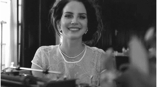
Another way that our music video uses the conventions of real media products is the fact that it includes a lot of lip syncing. This is a very typical element of any music video. We made sure the artist is shown lip syncing in a range of different areas spread very evenly throughout the video so that there is still equilibrium and the audience can watch it with ease. In the image above, there is a wide eye-level camera shot of our artist (Nova) lip syncing whilst laying on her bed. I think that this shot is particularly successful as she can be seen as appealing to a male audience (which is good as our target audience is both boys and girls) and overall looks very glamorous which is exactly how we branded Nova. There is, therefore, a very clear correlation between the visuals and the lyrics as in this shot she is singing 'am I glamorous? Tell me, am I glamorous?''
In the above image it shows Lana Del Rey lip syncing to her song 'Video Game's in her music video. This proves that our chosen artist also lip syncs throughout her videos and conforms to the conventions of music videos, much do the majority of artists- thus supporting our decision to do so.
Saying this, Del Rey does not lip sync throughout the entire music video and nor did our artist. She has a range of 'super 8 style' shots which look like a home video and other establishing shots to help place the entire video into deeper context. This is also a typical convention in music videos that I feel we stuck by.
We also wanted to stick to these conventions in this case. We made the conscious decision of filming a range of establishing shots to place into our video, we really felt that these would help build the atmosphere and set the scene for when our artist is first shown. The above sunset with panning camera work, is one of the first few opening establishing shots and it is deliberately placed there as it can be used to foreshadow what else may be seen further on in the video. We used a variety of sunset references later on (such as the projection on her back) and also used this theme of colours both throughout the video and ancillary products.
The above shot is an example of the opening shot of, again, Lana Del Rey's 'Video Games' music video. It also features an establishing shot of a location which is bright and colourful- coincidentally quite similar to ours which shows just how conventional our camera shot is.
In this close up wide shot, shown to the right, it shows some fairy lights twinkling. This is the second shot in our video, that Kate filmed, and has mainly been used for the aesthetic. The shot has a strong depth of field. Both our target audience and us said that this shot was successful, which shows that although it was not a shot of our artist, it was still well liked - showing the shot's importance.
Another typical convention we used in our media product was our use of multiple locations and costume changes. Music videos often used a variety of different locations as a way of keeping the audience interested and this is something we felt was necessary for our video. We felt that if we only use one location then the music video may seem repetitive and in turn, not look entertaining. We wanted to use both in and outdoor locations as this is something often seen in real media products. We got some brilliant feedback on our range of locations from our target audience, which shows that they have worked effectively together.
Using multiple costume changes was also very conventional of us. Through our extensive research, we noticed that in real media products, artists are almost always featured wearing different costumes. By including a large number of outfits, we are emphasising the brand we created for Nova. As well as this, the fact that the artist is in a variety of different outfits portrays the fact that there is a sense of a change in time- this is definitely true in relation to our music video as our narrative is based on the good memories Nova spent with her ex-boyfriend over the summer period.
Another convention we have conformed to is the use of camera movement within our video. We have used a vast amount of tracking shots (such as the wide shot above) and panning in our final product. I feel that this is a very conventional type of camera movement to use, especially the shot of the artist lip syncing whilst walking towards the camera whilst it tracks her. This is a very recognisable shot and something the audience will be very familiar with seeing, meaning that it will put them at ease whilst they watch.
This is an example of a tracking shot whilst Demi Lovato lip syncs and walks towards the camera. It proves that they are very commonly used almost in every music video- I think they look very successful, especially in ours. This is because they add a lot of movement to a video making it that bit more interesting as opposed to the camera just staying static. Despite this, we still used a range of both panning, tracking and static camera work to ensure that we had some
variety in our video- intriguing the audience.
We used repeated sequence in our music video, which is another typical convention of a video. During audience feedback we received comments saying that they thought the tracking shot of the artist walking and lip syncing towards the camera was the most successful. Also as Nova was lip syncing the chorus, we felt it would be highly appropriate to repeat this shot as chorus' are usually repeated in real media products in order to portray familiarity as they are the same lyrics. I think that deciding to do this was successful because it not only meant that our most effective shot was used more than once, but that the audience could relate back to this particular part of the video- perhaps making it more memorable which is always a priority.
Finally, another convention we conformed to was our use of slow motion. Which is also very often present in real media products. Slow motion is often used in the media to represent a look of love or lust which is also very relevant to our storyline. Within our narrative, our artist is remembering all of the happy memories she had with her ex-boyfriend. We decided to slow some of these shots down such as the point of view shot on her holding hands with him as she walks down the beach as we felt that it was a very emotive shot and we wanted to highlight this to the viewers to make them aware of the fact that she misses these memories. I think that using slow motion was successful as it created more of a contrast in comparison to other clips at a regular speed, therefore making some stand out more than others- this may make it more memorable to the viewer which is important if our artist wants to be successful in the music industry.
Challenging Conventions
A way in which we challenged the typical conventions of music videos was by the fact that we didn't use a male figure in our media product despite our narrative surrounding a relationship breakup. We noticed that in many real products, a male was seen if not at times, constantly throughout music videos if it was about a relationship- which most tend to be.
A real life example of this would be in Taylor Swift's music video 'Ours' which is a narrative based around her missing her boyfriend who is in the army. Throughout, it shows home videos of her and her other half and then jump cuts back to her current life bored in her regular office job dreaming of when he'll come home. The big difference between her video and ours however is that the point of view shots actually view the male whereas ours don't. In her video, there are either two person shots of the couple together, POV shots of the male filmed by the female (in our video we reversed this the other way so that the male's face is not seen) or one person shots of the male alone - this is a more conventional approach. The reason why we decided to break these conventions was because we wanted our video to have a stronger sense of mystery which made it that little bit more unique. We wanted the audience to question who the males was and why they broke up- I believe this makes the storyline more compelling which is why it was successful that we did so.
In Lana Del Rey's music video 'Ultraviolence' the entire music video is a shot of her (only her face and nothing else) with closeup shots and medium shots in order to restrict anyone else intruding the frame. It shows her in a bridal dress with the lyrics connoting that she is in an abusive relationship and should not be marrying this person. I noticed how the male figure is nowhere to be seen in this video, perhaps to signify her isolation. Del Rey has had a very similar approach to us in terms of the fact that there are many point of view shots of her and her fiance is not visible (although she only used on location therefore I don't think this video is as compelling as it could be).
Another way in which our media product challenges forms and conventions of real media products is that it doesn't include any props
. Stereotypical conventions of a music video with a narrative of love would include
flowers, a mobile phone if they are seen arguing etc.
An example of this is in Taylor Swift's 'We Are Never Ever Getting Back Together'
music video where a variety of props are used- this video has been shot in completely one take and so they used props amongst other things to distract the viewer whilst they prepared for the next scene, cameras still rolling. Props are predominantly used to tell a story in a clear and concise manner- we wanted to break these conventions and go for an approach which made our storyline vague enough for the audience to interpret it however they wished but still clear enough to an extent to which the viewer has an idea on what has happened (in our instance, heartbreak).
We focused on using aesthetically pleasing scenery on location to keep the audience more entertained as the thought of not using props at all could sound like our video would be quite dull. I'd say that because we kept to a bold and consistent colour scheme and have evenly used lip syncing throughout, that props were not needed.
Many performance based videos use props such as microphones and musical instruments whilst the artist is lip syncing. This can be seen in Lana Del Rey's performance based video 'Young and Beautiful' where she is performing throughout the whole video and violins/the live orchestra is a huge focus. The reason why we decided to break the conventions of using props associated with performance based music videos is because we felt that it would detract the viewer away from the narrative of our story which was a big feature for us because we wanted our video to be emotive and using props such as instruments would be a distraction.
Another code and convention we have broken is the fact that we haven't used technical facilities such as a green screen. Although we had a green screen available to us, we thought that we would challenge these typical conventions in music videos as sometimes the resulting images they produce do not look realistic and that would be something we would really aim for.
An example of green screen in real media products would be the London skyline and fire in Taylor Swift's Bad Blood music video. Although I believe that it works for the video itself, I am still able to tell that a green screen has been use- it doesn't look completely natural and as the rest of our video is surrounding shots used in nature, it was vital that we avoided facilities such as this- we wanted the emotion portrayed to be as raw as possible.
We are glad that we decided not to conform to this convention as it wouldn't be right for our music video and our target audience feedback suggests to us that they like the shots/editing techniques we used as it is.
Another convention we chose not to conform to was the fact that we didn't use any diegetic sound. This means that we just stuck to allowing the audience to hear the song track and no other sounds that would be audible on set (such as birds tweeting). It would have been conventional of us to include sounds of the wood burning in our bonfire scene for example (along with the song) however we chose not to as we wanted to capture a greater sense of mystery- (this is heard in many music videos of this genre, especially during the intro before the song has actually begun). Had there been diegetic sound, the viewer would know that (for example) the couple were having a row in the background or that they were laughing and having a good time. By choosing not to allow the audience to hear anything other than the song raises questions and I think that curiosity is always a great thing- it entices more interest and that is exactly what we wanted.
In terms of our ancillary products, I believe we have both challenged and conformed to the forms and conventions of real media products.
Our Digipak is overall rather conventional, here is why:
How we have conformed to typical forms and conventions of real media products: We displayed a tracklist in the very centre of back cover in a chronological list which is how songs are typically laid out on many albums. Saying this, we did not use numbers beside each song track which is a stereotypical convention on a tracklist- this was a successful decisions to make because we felt that numbering them would add too much structure and we were aiming more for creativity. We also conformed to using a bar code, artist logo, record label logo and copyright information on our digipak. This was also a successful decision to make because it became informative and also made it look of a professional standard which is something we always aimed for- evidence of this was in our audience feedback when we got many of the same 'professional' compliments on our digipak.
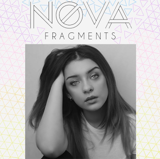
Conventions we challenged: Our main album front cover image has been edited to be black and white. Typical conventions of the images used on the alternative pop genre front covers (same genre as ours) are that they are usually colourful to pop out at the audience. As well as this, the images of the artist are normally cut or blended out so that the entire front cover look like one whole image, rather than multiple. We decided that we wanted to break the conventions of having a colourful image on our digipak front cover as a black and white photograph appears very slick and professional, perfectly fitting for our mature artist that wants to be taken seriously. As well as this, we decided not to blend the picture in with the rest of the album front cover as it makes Nova stand out further, allowing her to be the star of the show. I think that we made very wise decisions that turned out to be successful as our target audience said that they loved how it turned out during audience feedback and that is who the product is aimed at.
Magazine Advert:
How we have challenged the conventions: We have used a different image on our magazine advert in comparison to our music video (it has not been taken from one of our filming days on location for our video). We decided that we wanted to take a new photograph that was completely different due to the fact that the audience would have already seen the other possible images and we felt that they may want to see even more of Nova. For this sole purpose, we arranged a new photo shoot to take more pictures of the artist- this is also a good thing because it means the target audience will be kept excited and entertained about new content. Simply recycling the same pictures may become boring and her fan base may begin to decrease which is why the artist needs to stay active.
How we have conformed to the conventions: We have conformed to the way in which the dates were listed (in a chronological list) however they are still displayed on the same photograph whereas many real media products display the dates on a separate layer of block colour. Another way in which we have conformed is by using our artist's logo, record label logo and social media links on there- it also advertises release of album as well as tour. It is good that we conformed to these typical conventions because we liked the fact that the poster was able to promote other events as well as the tour itself. Also the social media advertisements meant that her fan base could grow even further as the digital age has increased the intimacy between listeners and the artist.
Digi Pak Inserts
In our digipak inserts we used pictures from both of our filming days (in the gallery, Margate and in the studio) which is a more conventional approach to have. This is as the audience can cast their minds back to what they have witnessed in the video and make a clear link between the two- this adds more consistency to our overall products. Either this or they may not have watched our music video yet, meaning that the album inserts are used as a persuasive tool to make them want to watch it because it looks so visually appealing. We have used conventional eye popping colours for our chosen genre of music. The lighting colours look as if it has been filmed in a studio (which it has), giving off a professional vibe and is very conventional of a music video. We used a whole page of the insert with simply just an image of the artist which is also a conventional element to feature in a digipak insert. This is because, during our research, we noticed that most artists have 'posters' of themselves on a whole page, mainly as it looks aesthetically pleasing but also because they want to increase the familiarity between the fans and the artist- this is a good reason why we also chose to do this and it was a successful decision to do so because it loos very visually pleasing and rather professional. A convention we have challenged within our digipak inserts is the fact that we decided to position our text so that it is arced at an angle to fit against the wall. We thought that this would be a more inventive way to display some font which is usually quite a boring subject matter and place it at an angle rather than the traditional way of how you would normally read any writing. This was a successful decision because the text looked as if it had been naturally merged within the photograph which gave it that professional quality.


